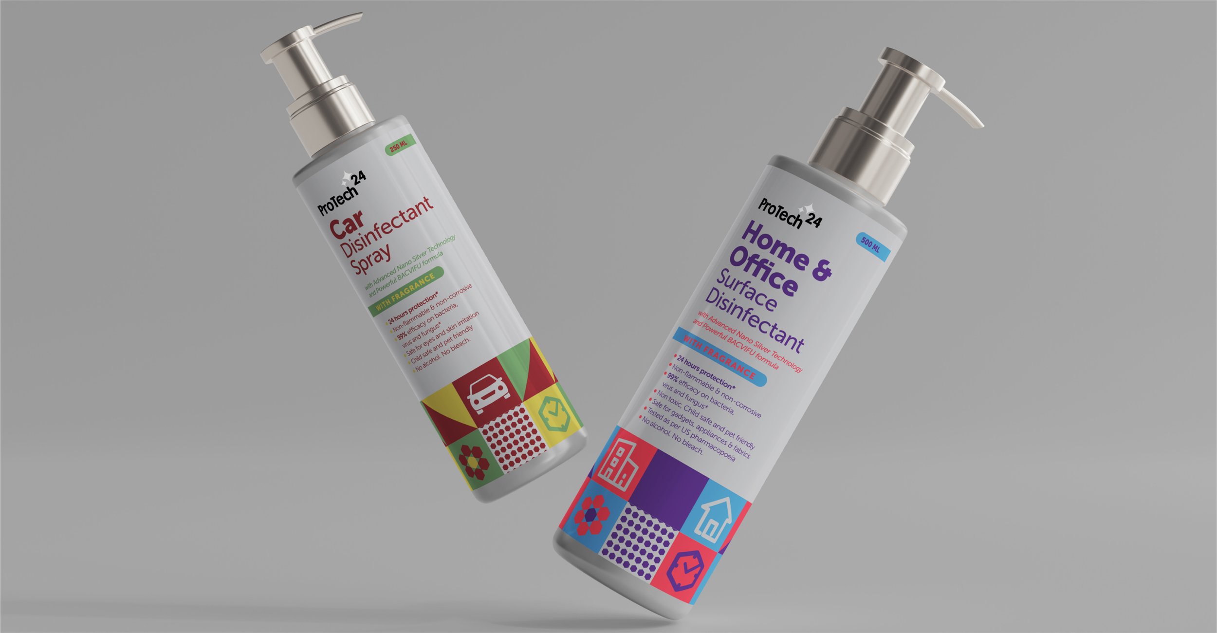
PROTECH
We’ve all done a lot of disinfecting since 2020, and in a market that suddenly boomed with cleaning products, Protech wanted to stand apart with a design that was informative, intriguing and inviting.
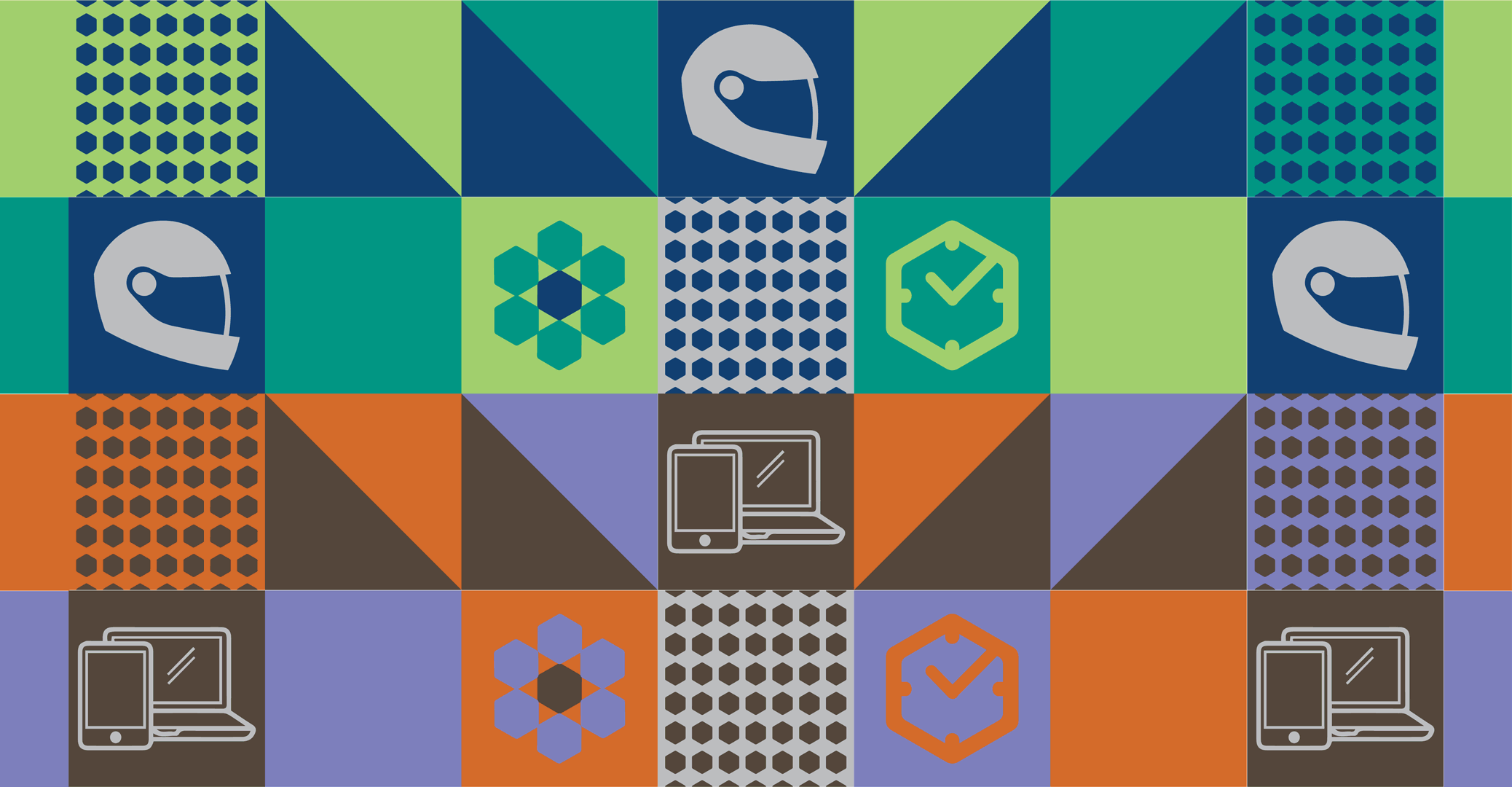
Most branding in this space is cold and clinical but we wanted Protech to take its visuals in a more unique direction that also highlighted the distinct usage of the products in its range. The custom graphics instantly inform the customer on what the product’s exact purpose is. The distinct sparkle on the logo cues the promise of leaving surfaces sparkling clean, and the placement of the “24” signals a number raised to the power of infinity, suggesting the product’s infinite power to zap those germs.
Discipline: Design Strategy, Brand Identity, Packaging Design