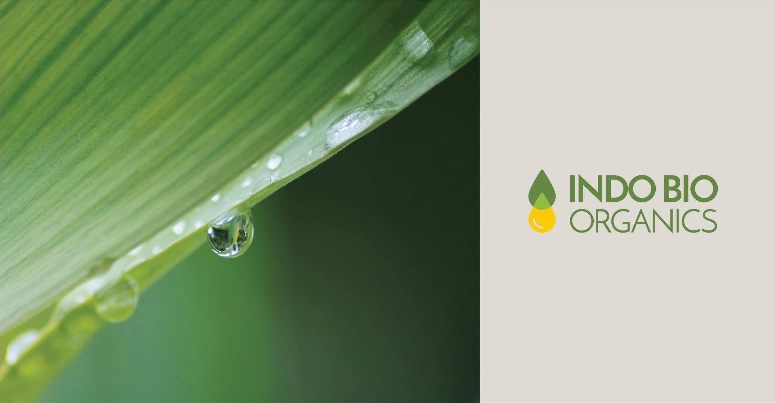
Indo Bio Organics
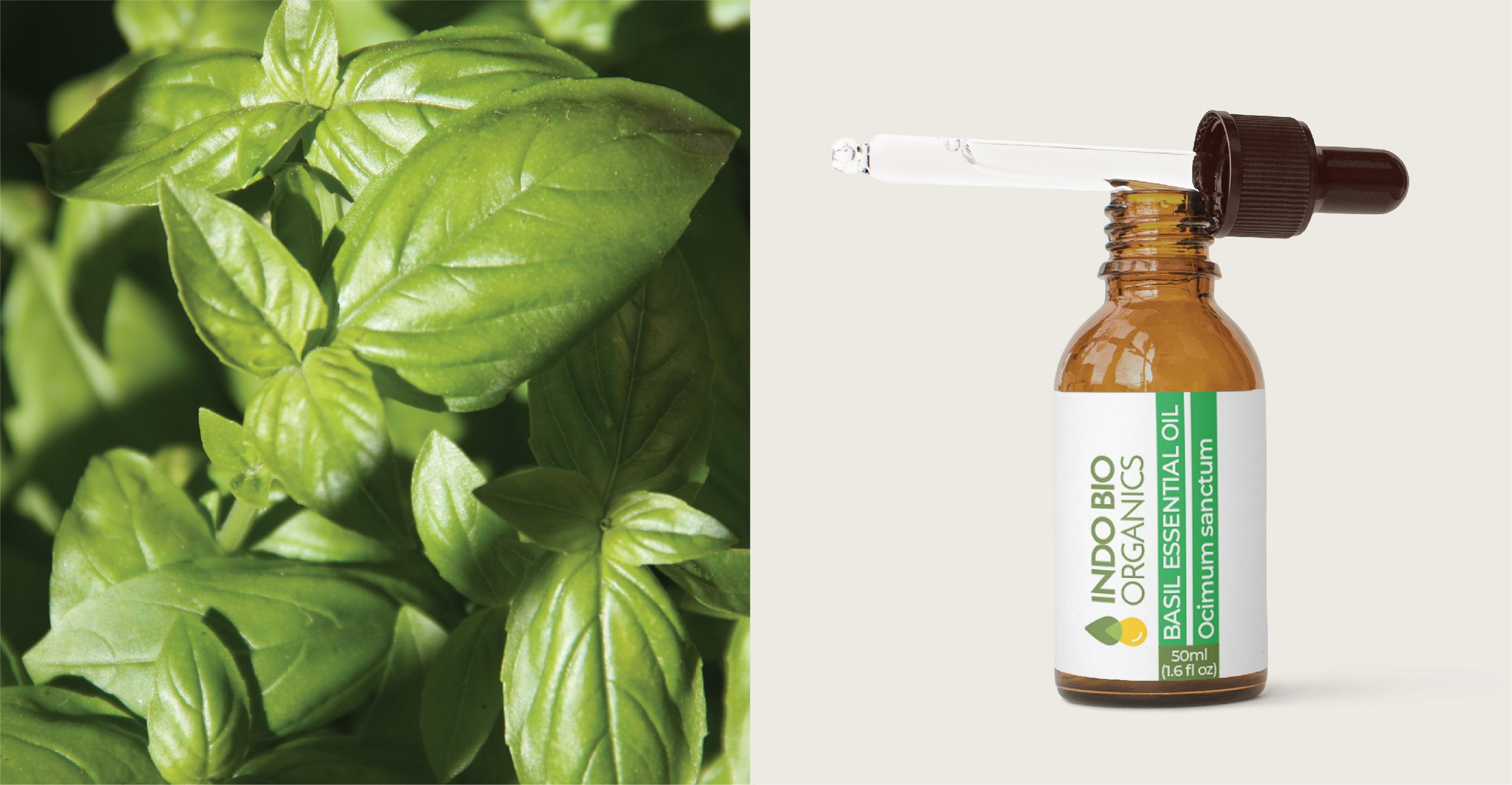
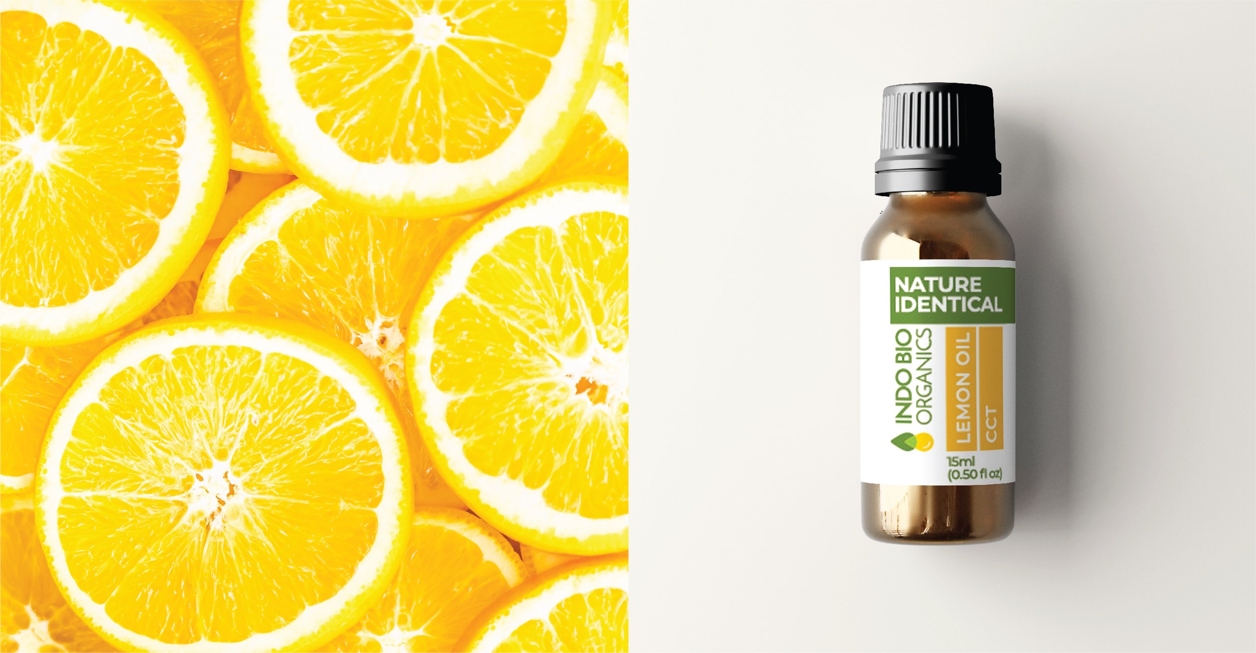
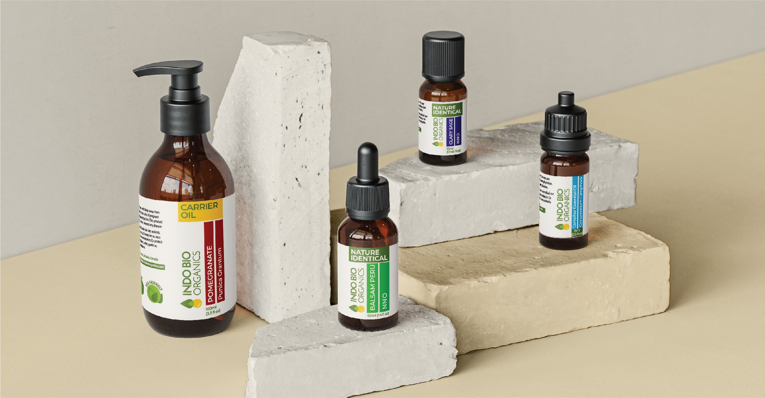
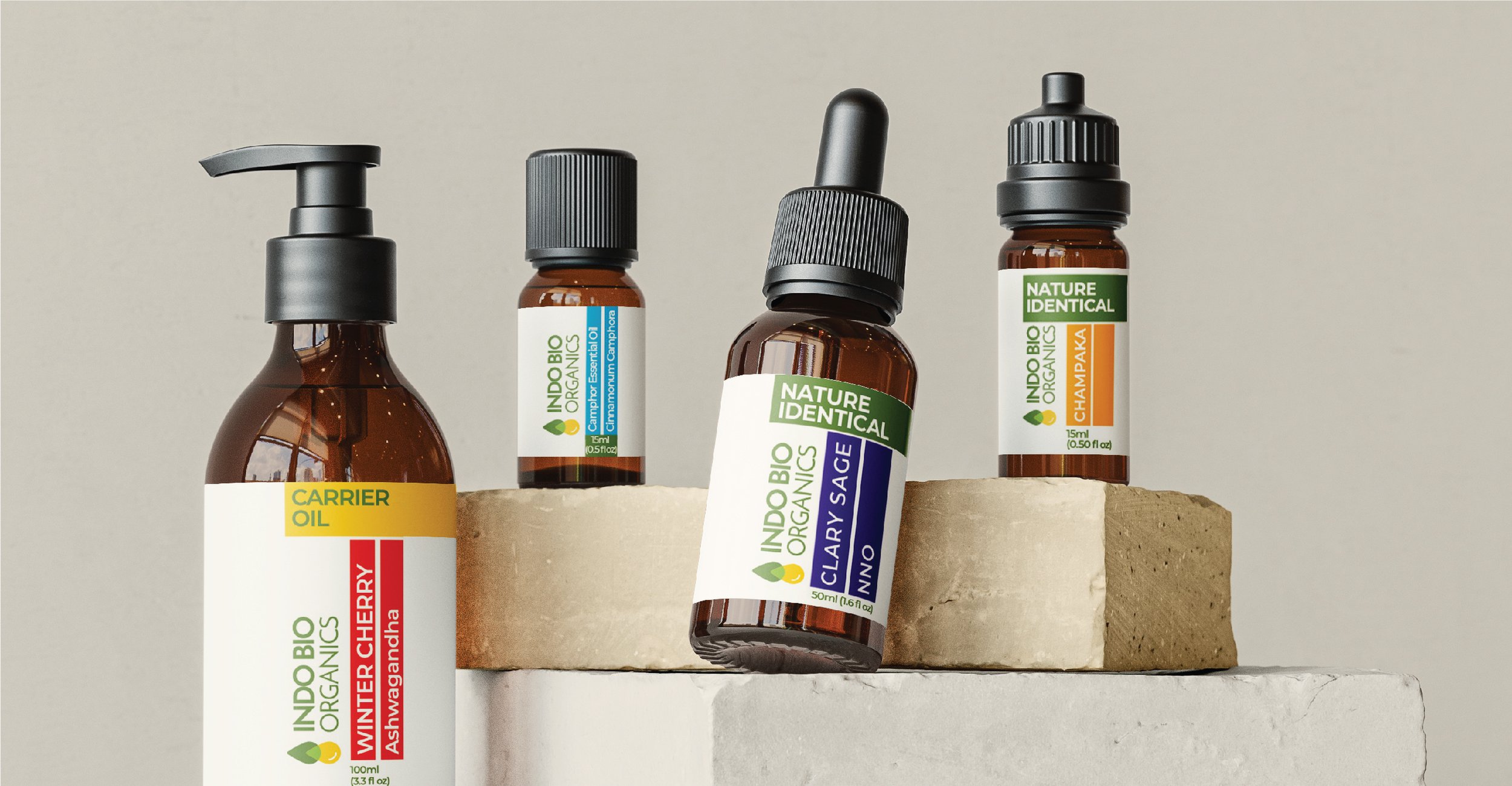
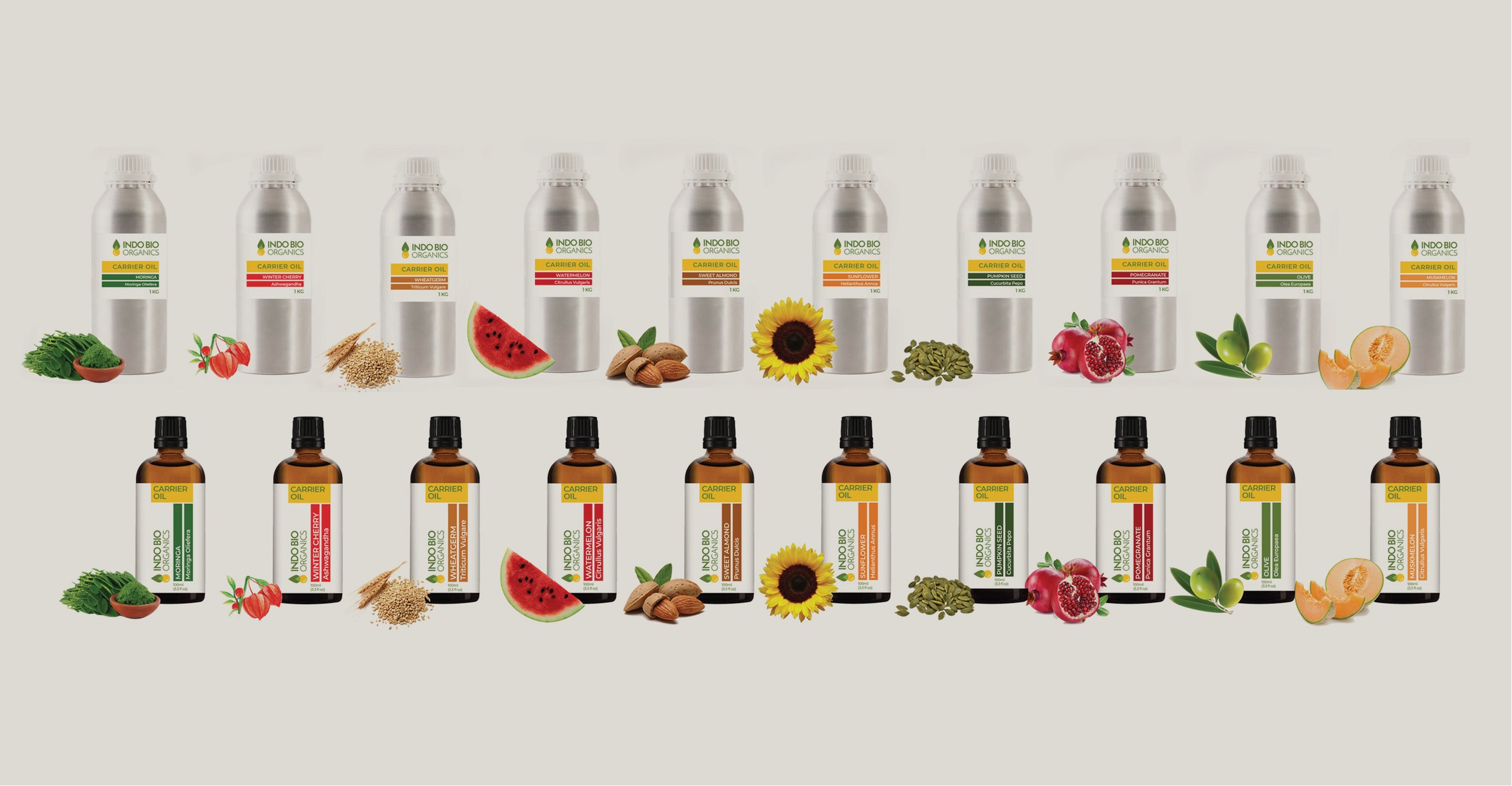
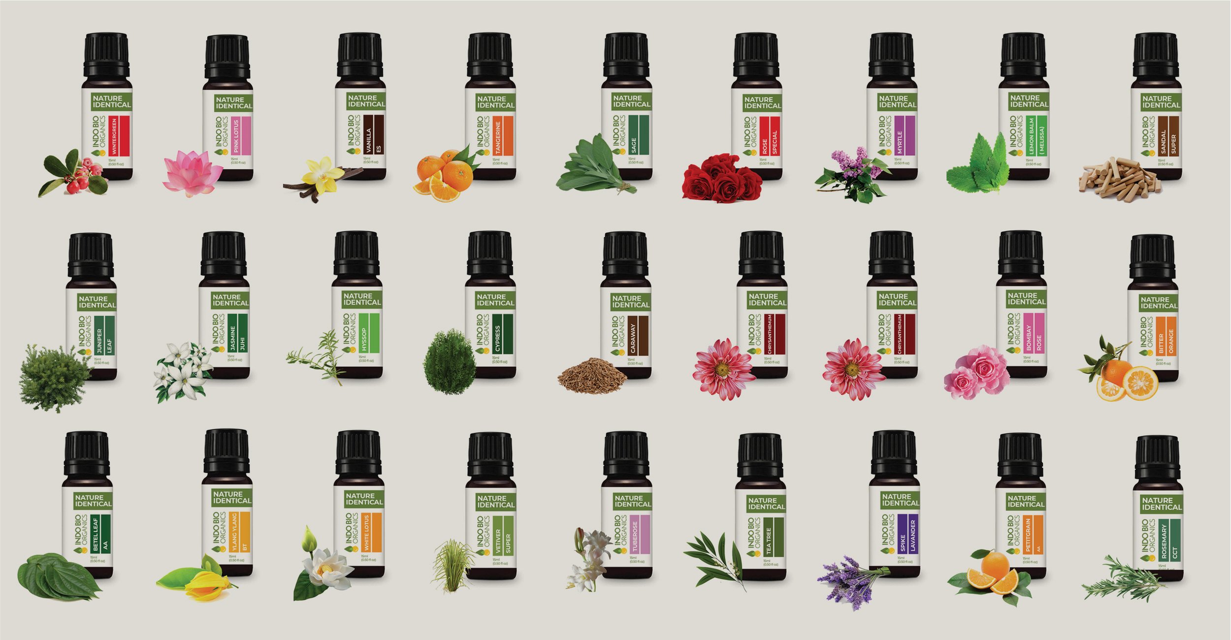
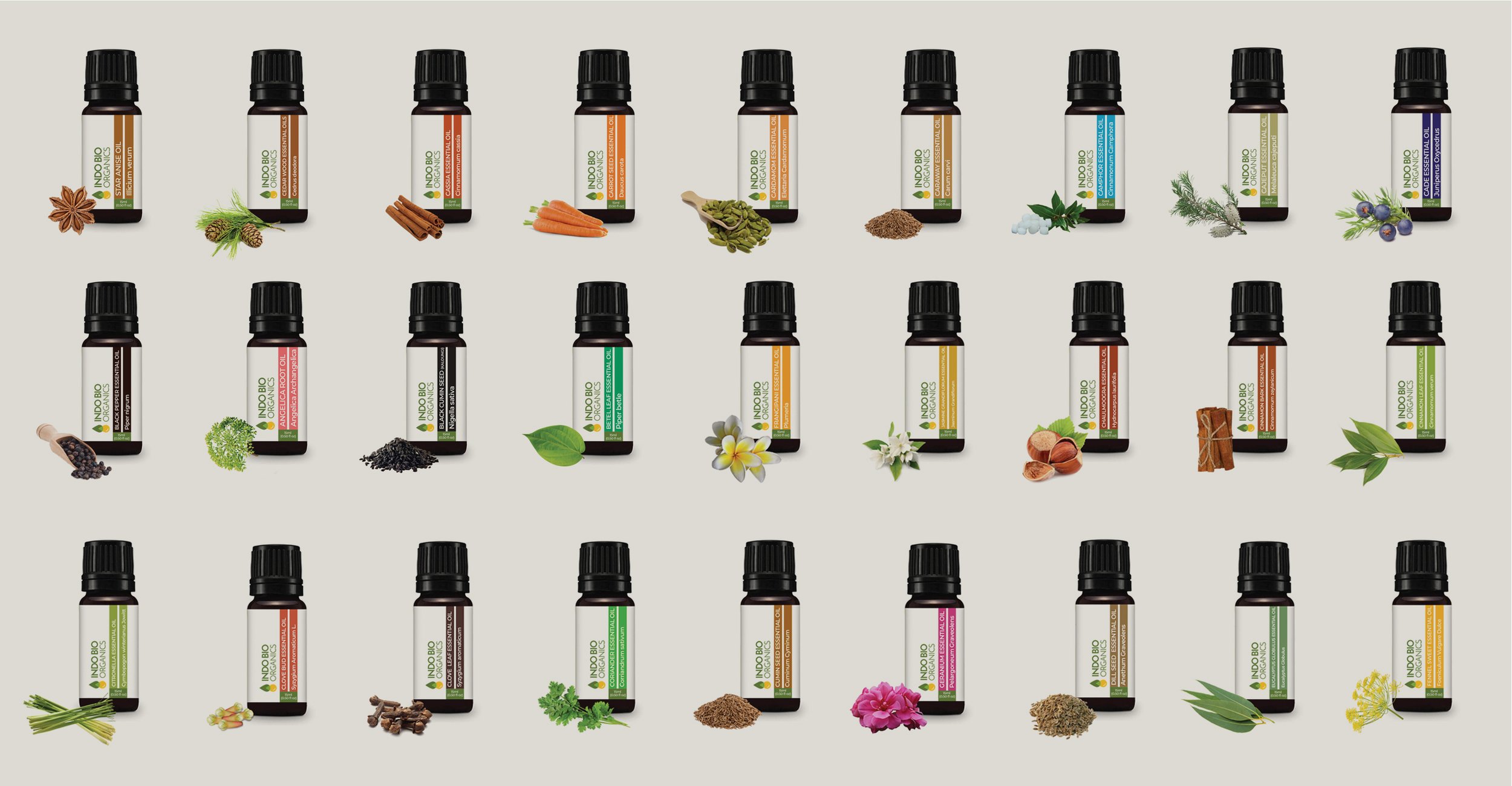
Indo Bio Organics is a Canadian brand of essential and carrier oils that are sustainably sourced and distilled with care. Their portfolio of products is diverse and showcases their commitment to purity. They reached out to us for a brand identity and packaging design that communicated this commitment. The challenge was to develop a design language that could extend over the multitude of product categories, subcategories and SKUs they produce - over 200! We had to formulate a strategy to harmonise them while preserving some differentiation between the various units.
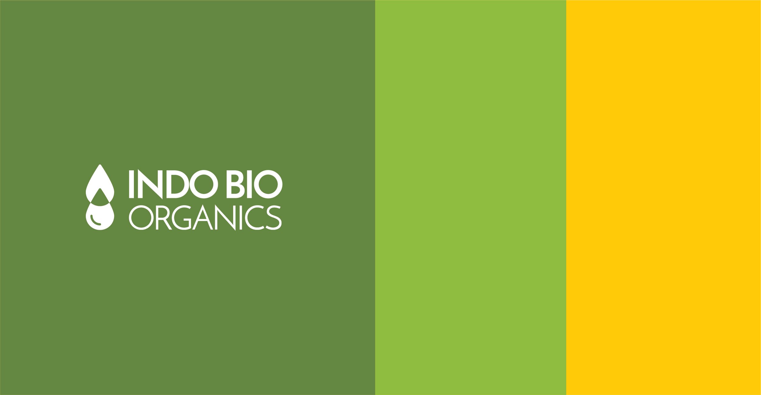
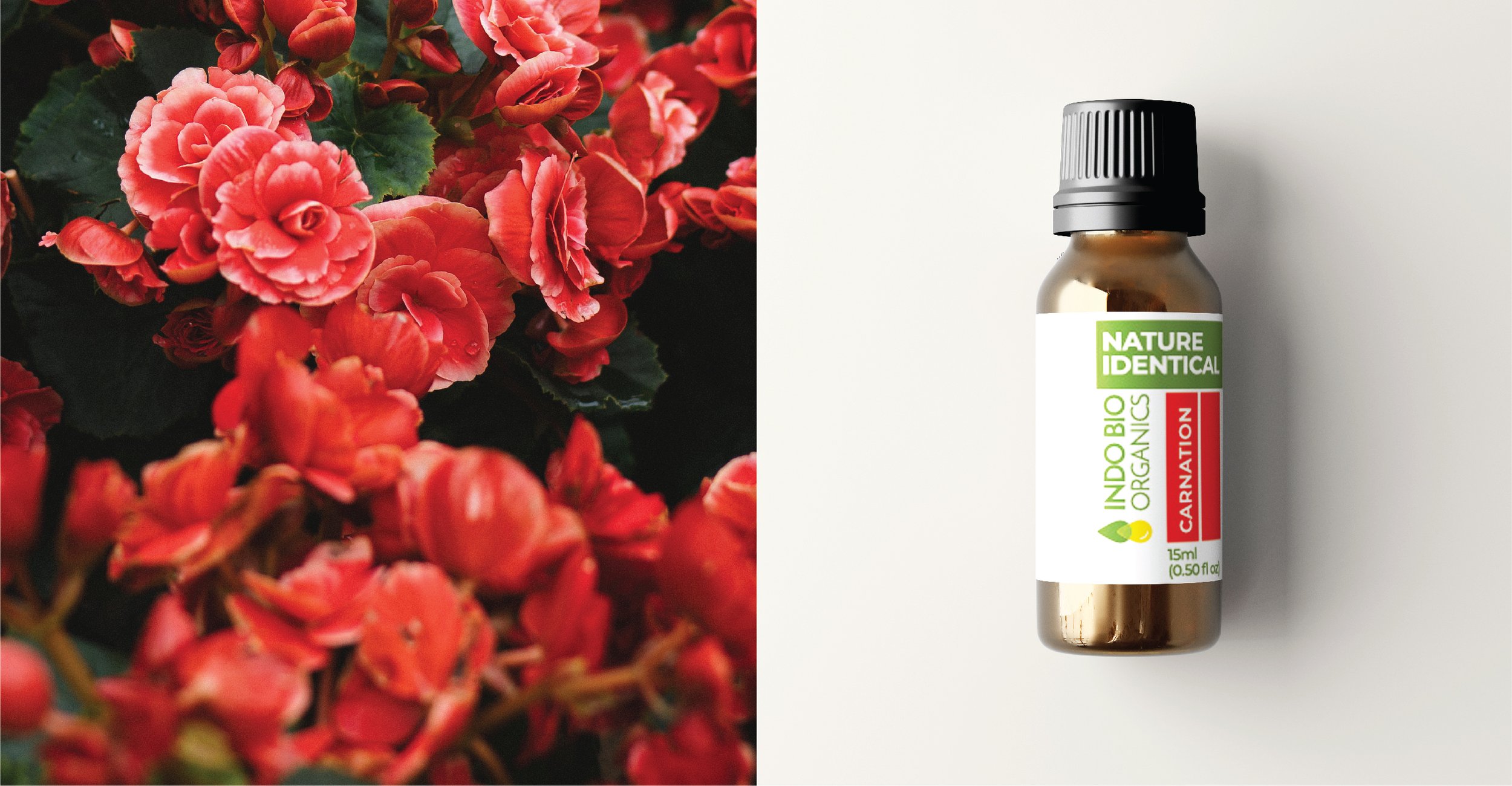
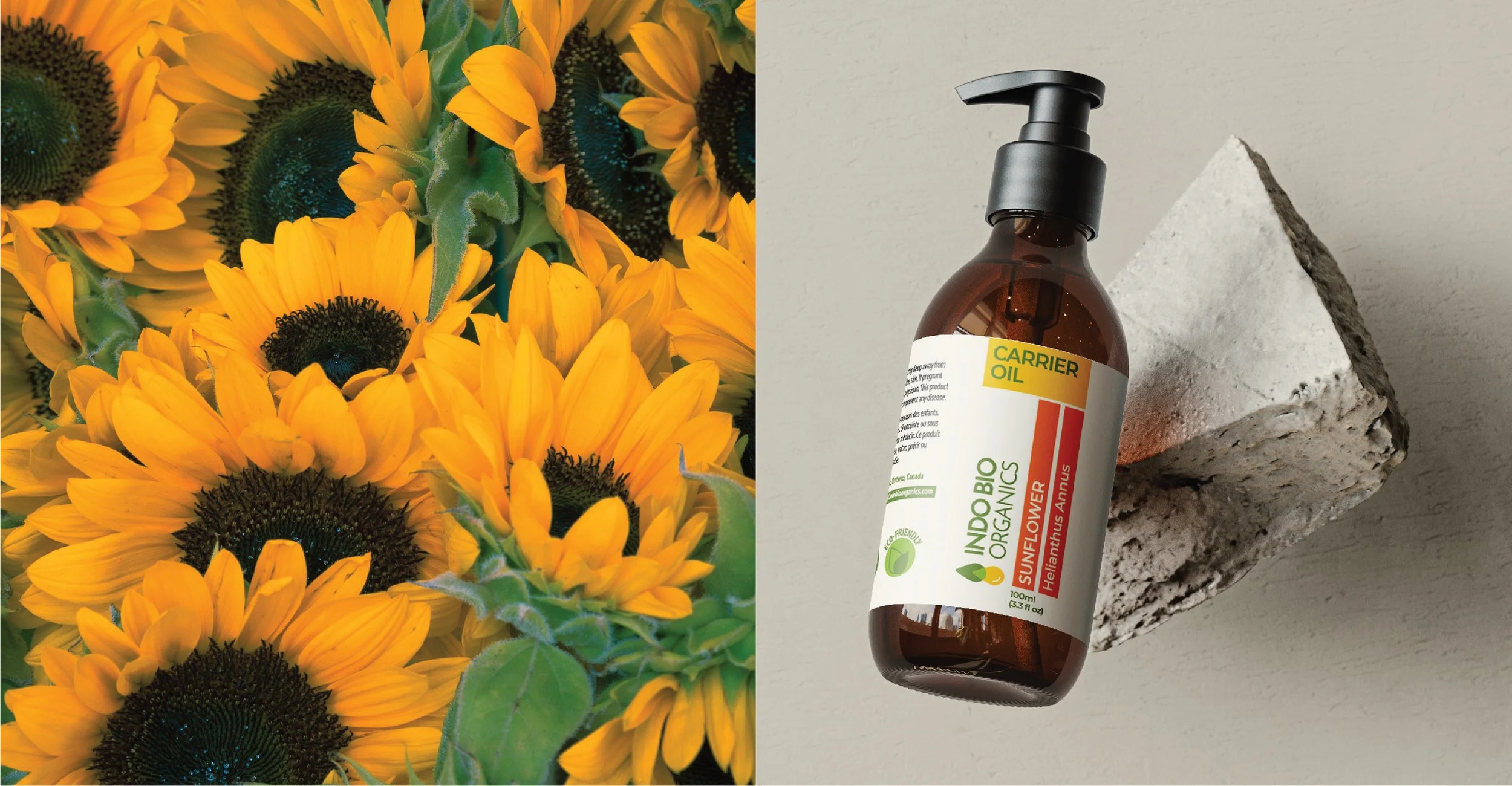
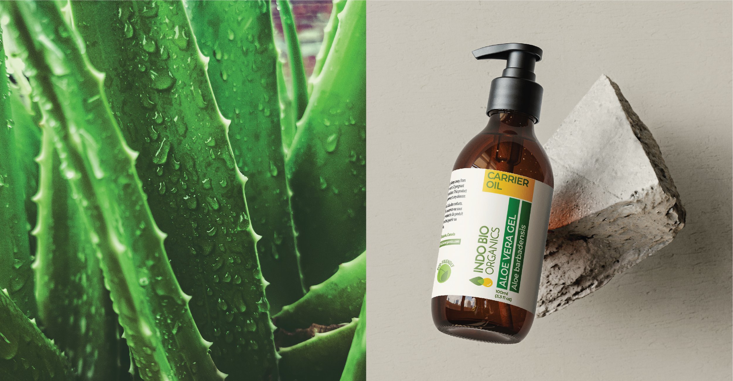
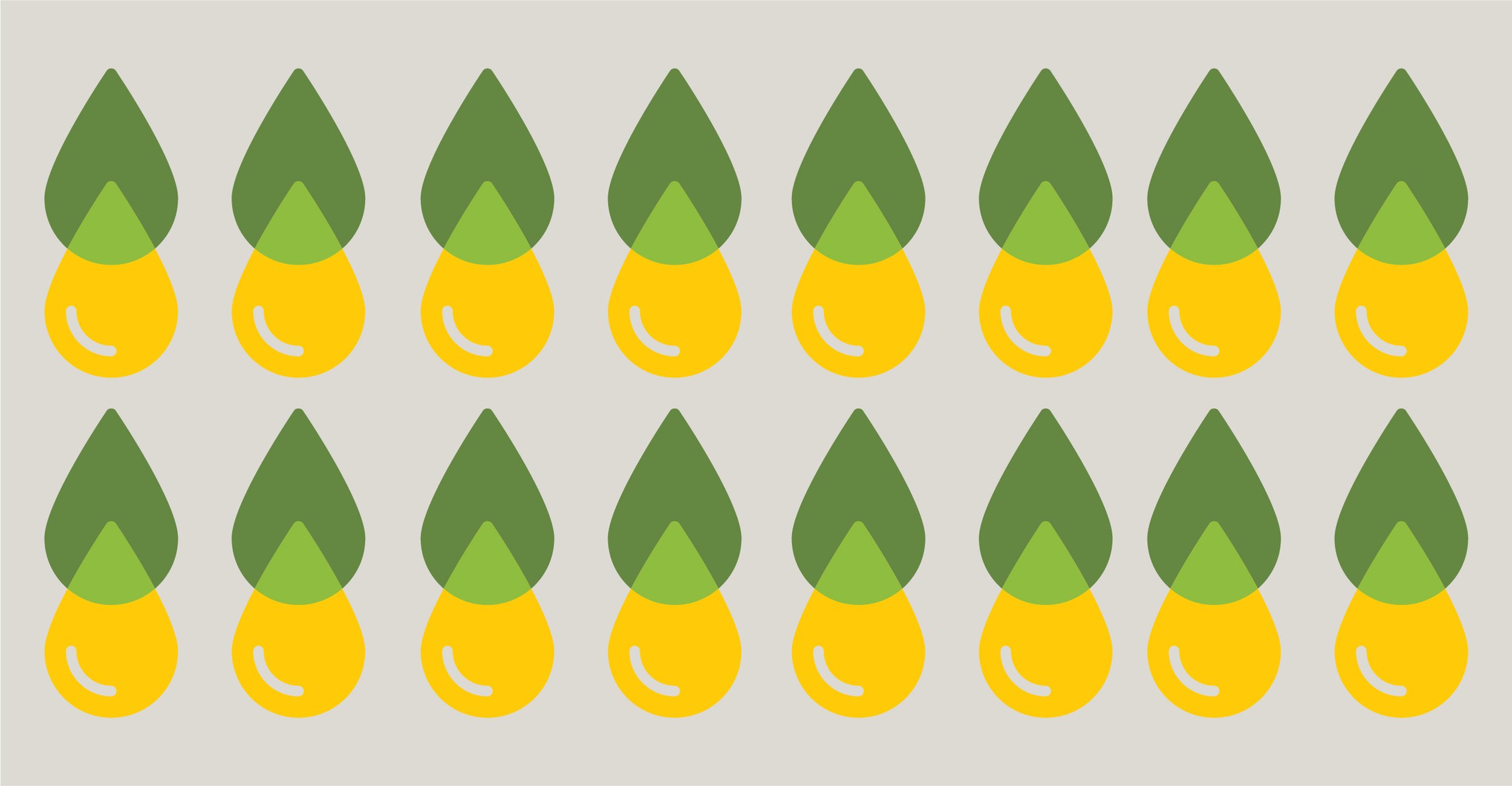
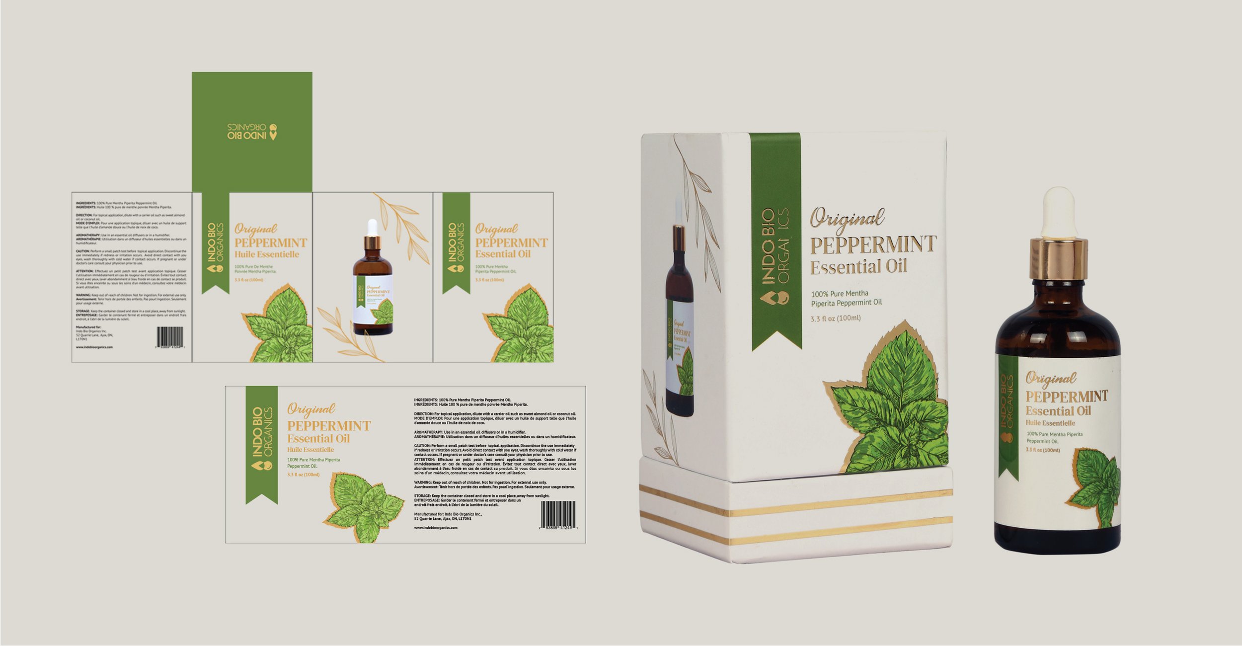
Our solution was to utilise different colours derived from nature to differentiate the oil subcategories, and coloured tabs to accentuate the different types of oils. We conceptualised a logo design using changing drops to convey the purity achieved by distillation. Natural and organic colours were used throughout since they aligned with the proposition of the brand. For the packaging for the premium edition of the oils, we created a sense of luxury by incorporating gold accents into the existing design formats. The overall impression was of a contemporary, stylish and trustworthy brand.
Discipline: Brand Identity, Brand Guidelines, Packaging Design