Reelabs
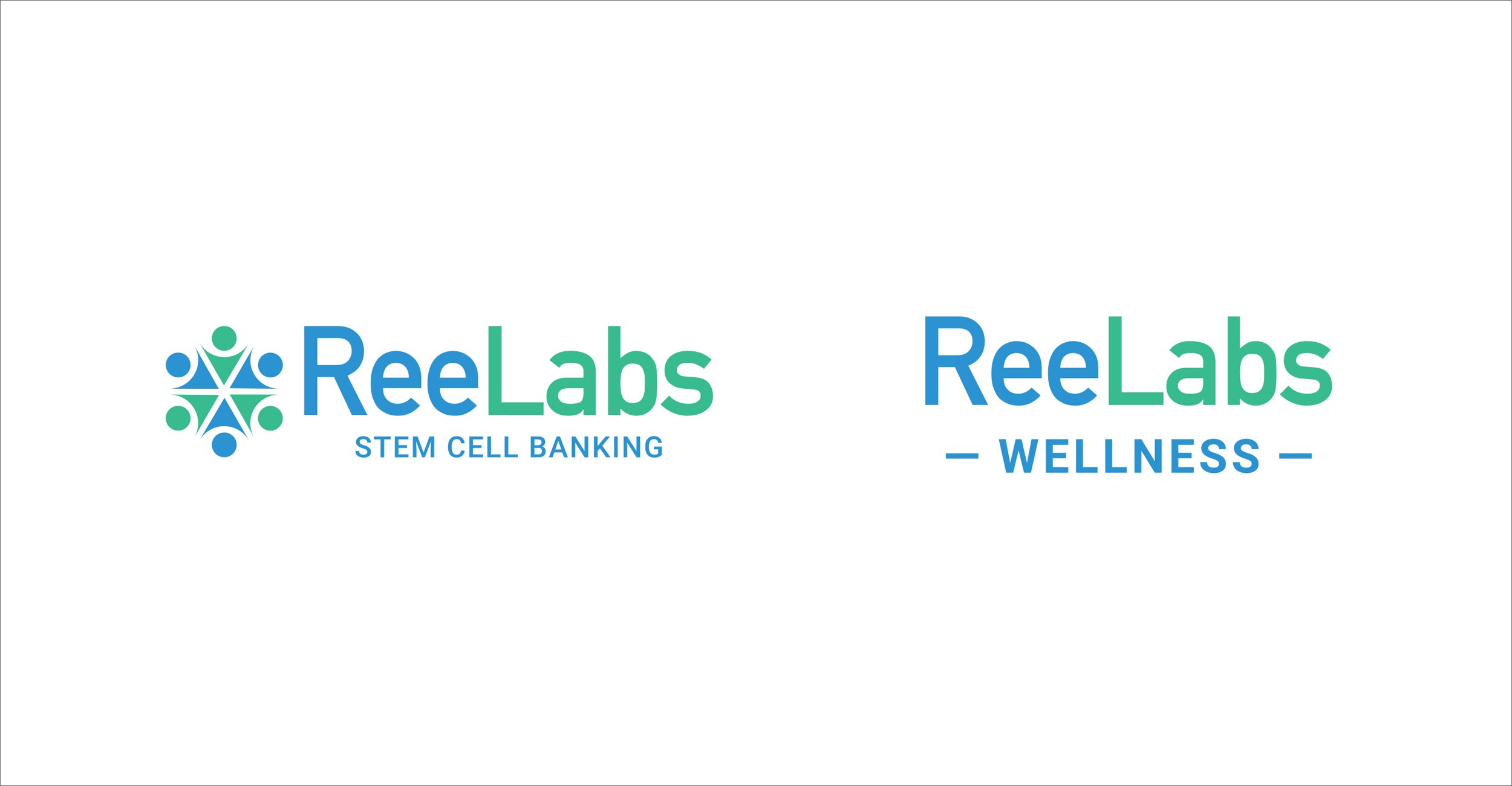
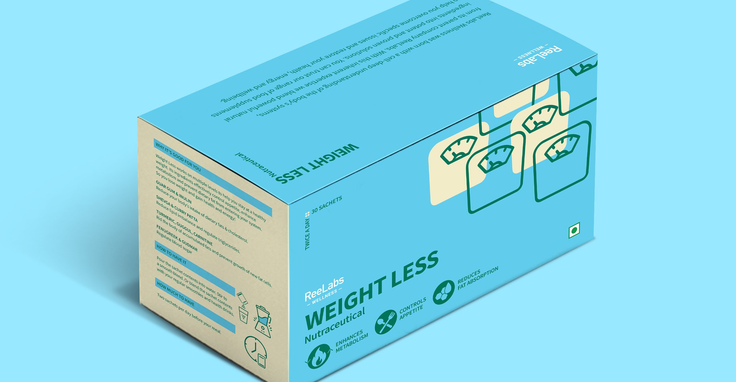
ReeLabs is among Asia's largest stem cell enterprises, with strategic collaborations with over 300 medical institutions. Our brief was to refresh and modernise the ReeLabs logo while retaining the symbol and basic colour palette and to develop the packaging design for all the sub-brands.
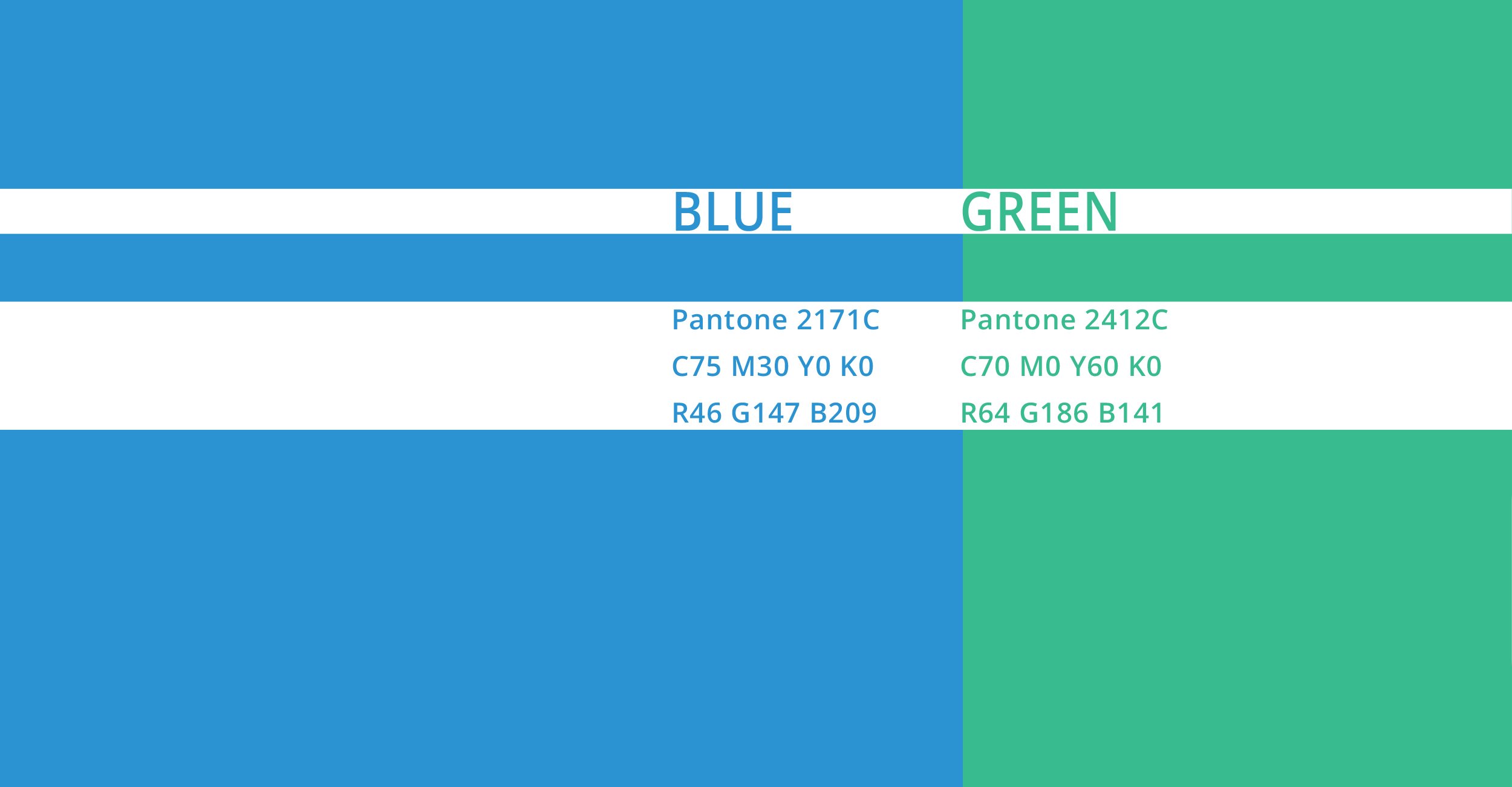
Our approach was to present a contemporary brand that is relevant, versatile, backed by proven scientific research, yet approachable and connected.
In order to create a cleaner and simpler brand architecture and better brand connect we removed multiple levels of sub-brands and integrated the entire wellness product portfolio under one roof, “Reelabs Wellness”
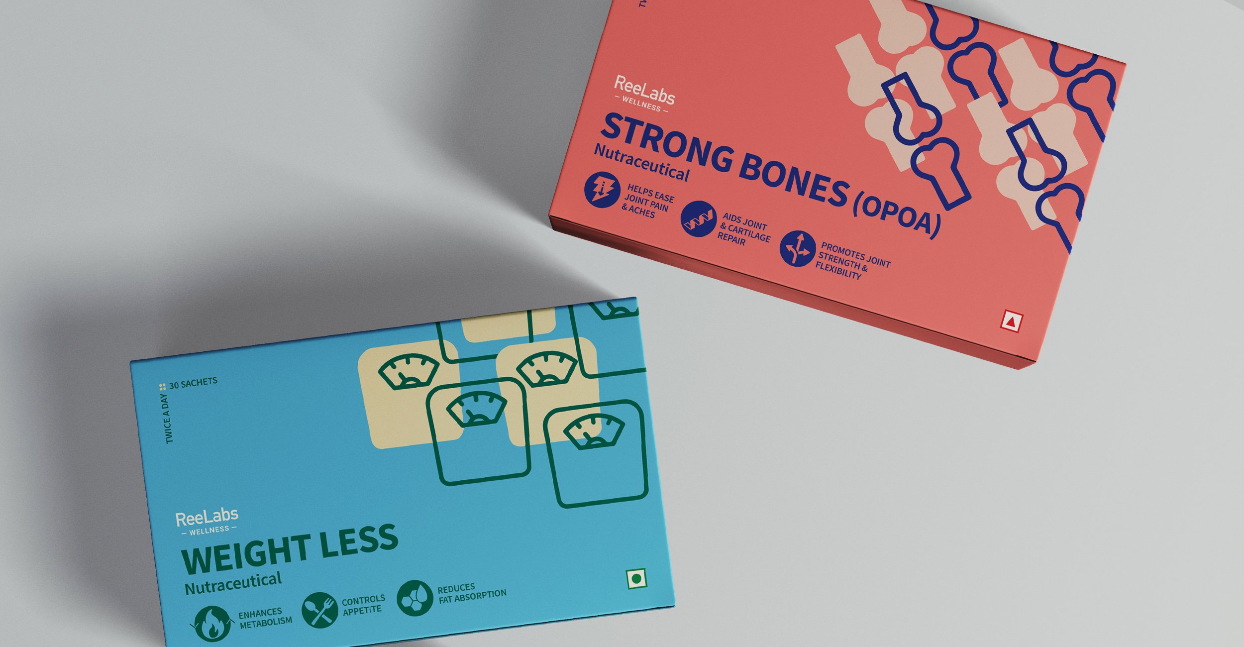
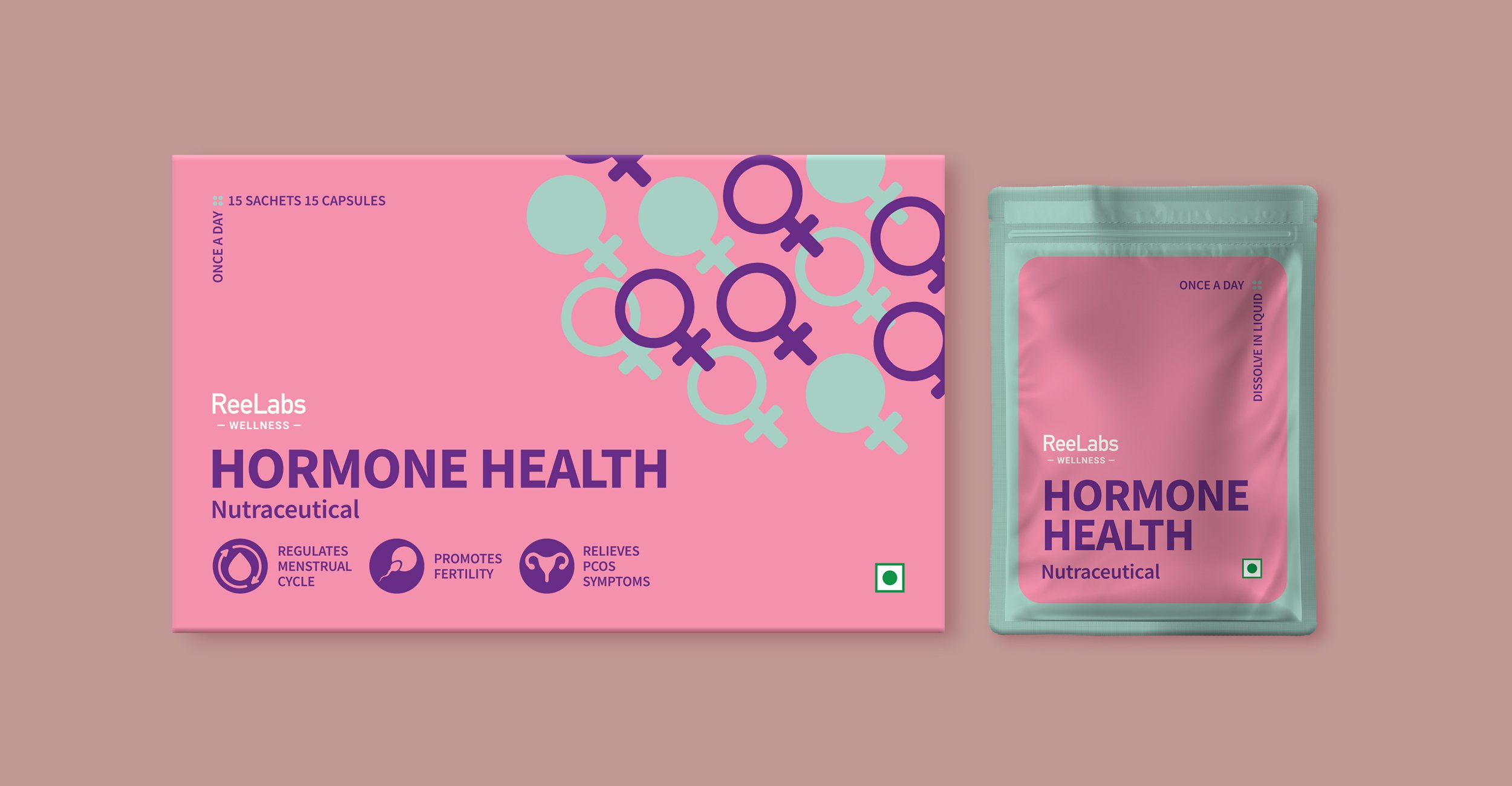
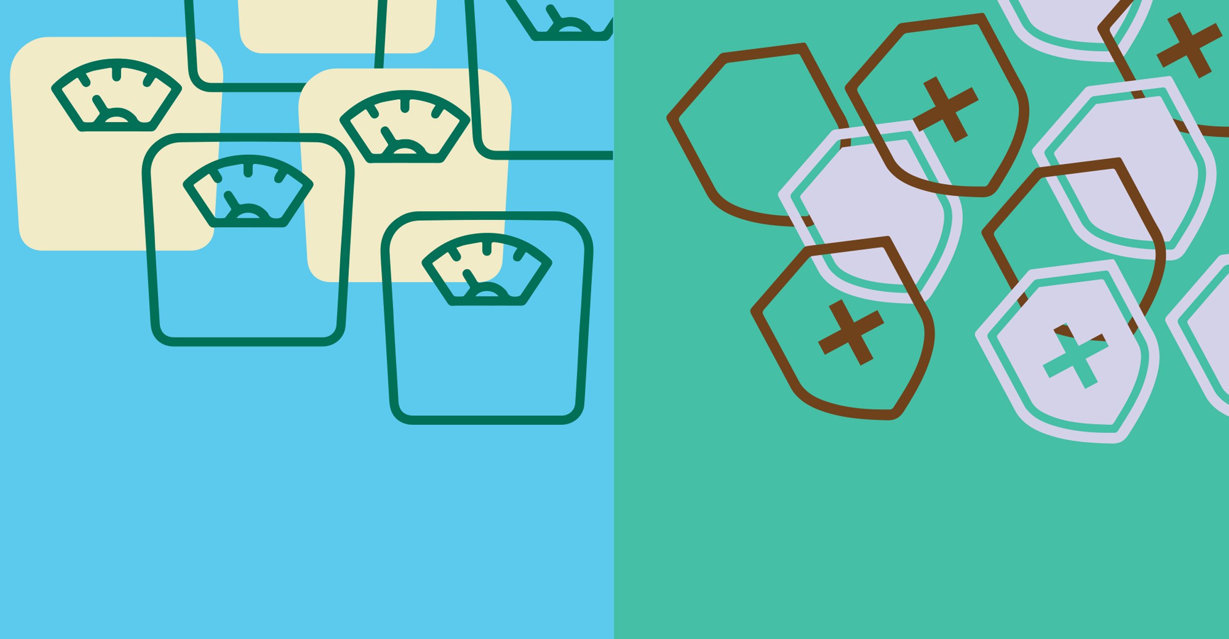
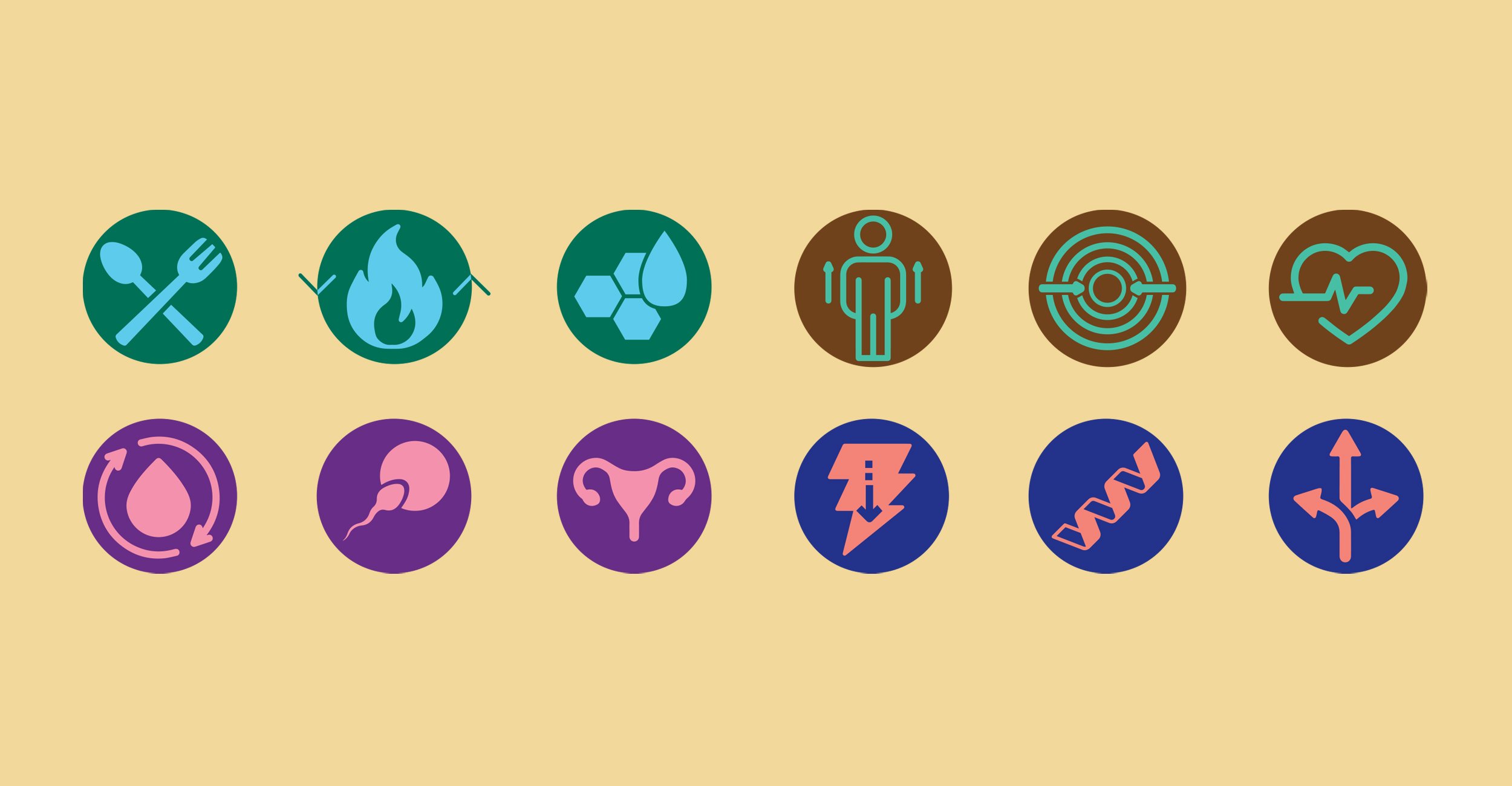
The ReelLabs Wellness logo is crisp and distinct while resonating with the parent brand. The packaging utilises benefit-based nomenclature, identifiable graphics and fresh and modern colours for instant consumer appeal. It has helped ReeLabs Wellness establish a distinct identity in the wellness industry while carrying forward the parent brand's legacy.
Discipline: Brand Identity, Brand Guidelines, Packaging Design